
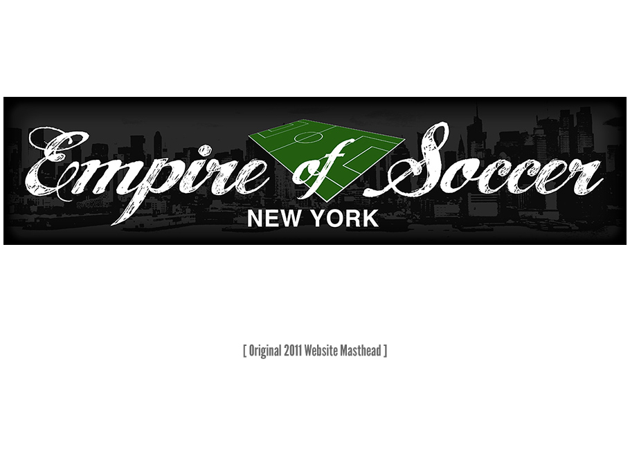

When freelance soccer journalist Dave Martinez put out word in 2011 that he was starting a new website covering the sport across the New York metropolitan area, fans and fellow journalists alike took notice.
As one of those fans – and one with a good understanding of what Martinez was looking for – principal Scott Shields had some immediate ideas for the new site’s identity. All too often, the visual vernacular of American soccer involves either suburban imagery tailored to soccer moms or lazy mimicry of English football. The new Empire of Soccer brand would embrace a young, urban aesthetic geared toward a new generation of American soccer fans, rejecting these old cliches.
This isn’t your parents’ soccer site… or your kids’.
In 2013, with the site’s stories attracting international coverage and traffic growing exponentially, it became clear that the time had come for Empire of Soccer to graduate from a simple blog-style WordPress theme to something more advanced. With an expanding number of professional teams garnering coverage and a growing stable of staff writers, giving the site a clean, organized user interface that put each team and the site’s various special features on equal footing, becoming the go-to news source for New York area soccer fans without showing preference to one team or another.
Our goal was to meet – and exceed – the visual standard set by sports news sites like Vox Media’s SB Nation Network and Bleacher Report, once again maintaining a forward-thinking urban aesthetic that breaks the tired mold of what the American soccer audience has come to expect. As a secondary goal, for fans checking for results on the go, the site’s overall design aesthetic and organization had to carry through to the mobile and tablet experience. The site’s responsive design achieves exactly that, losing none of the strengths of its desktop design and interface.